
BHG Financial

Making the Brand Make Sense
Refining and rolling out a half-built identity across B2B and B2C channels
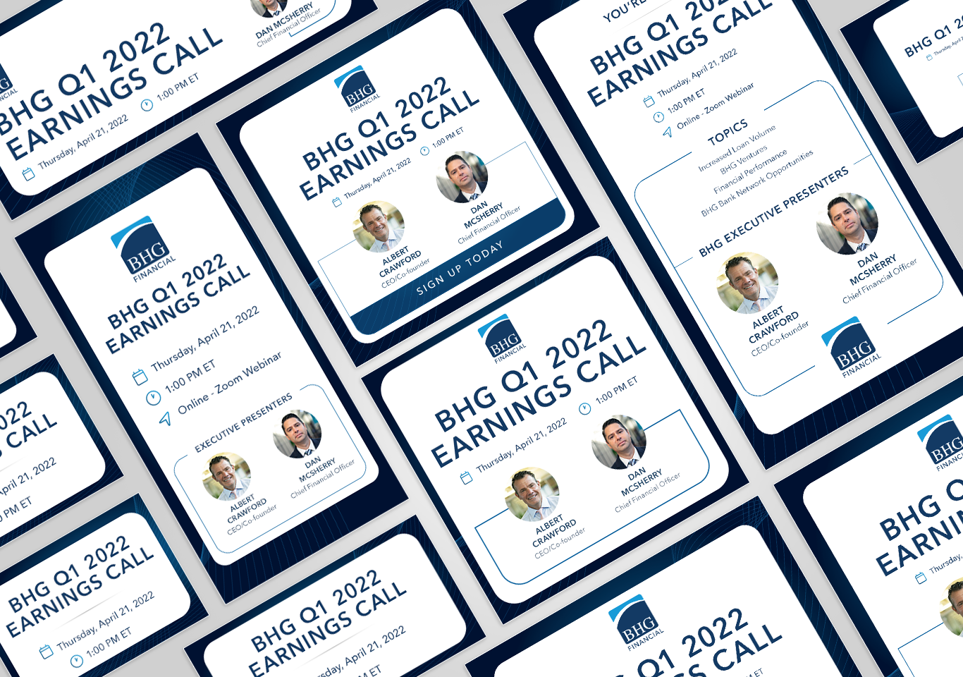
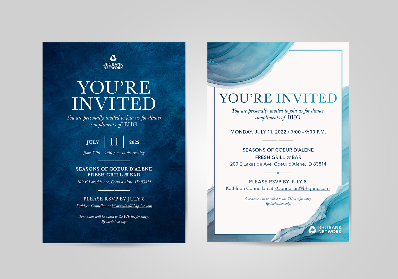
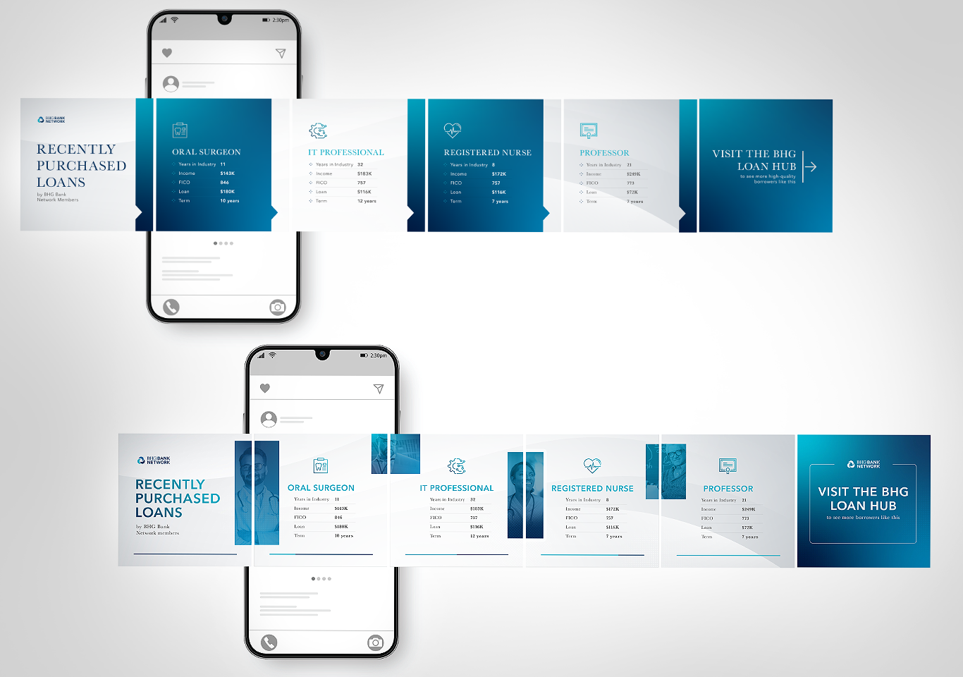
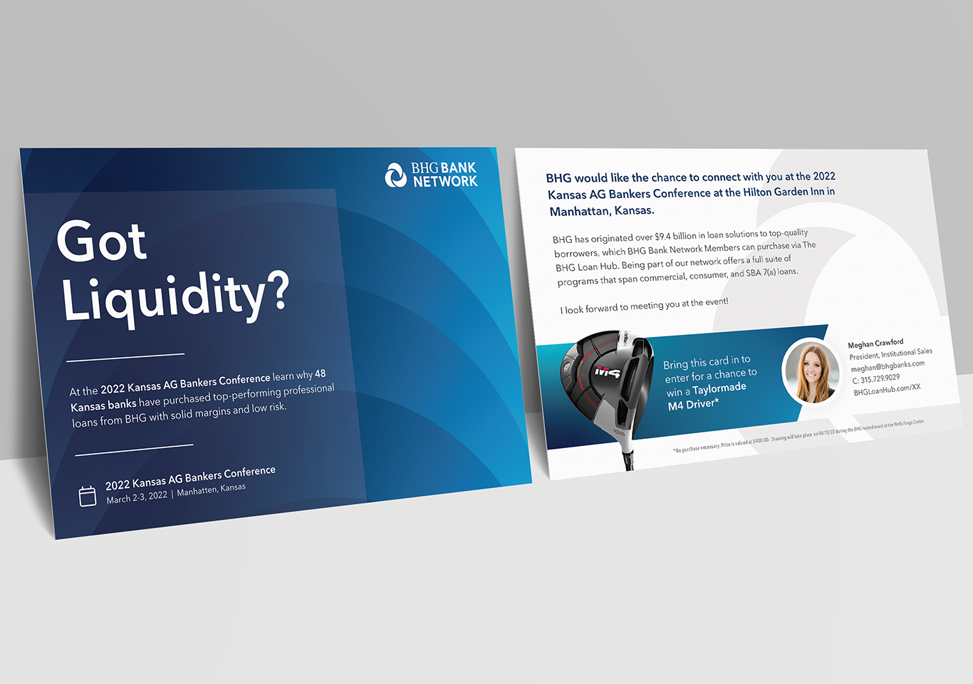
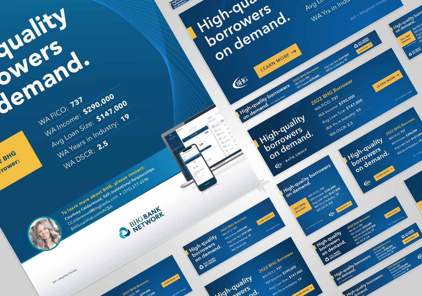
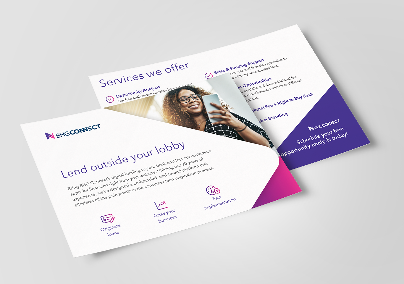
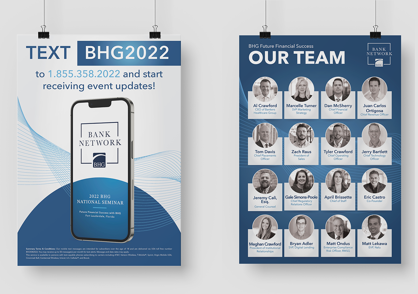
When I joined BHG Financial, the brand had already been in slow rollout for five years. It wasn’t consistent, and it wasn’t fully implemented, especially across the BHG Bank Network, one of the core pillars of the business. The challenge was to take what existed and make it functional, polished, and scalable for both internal and external teams.
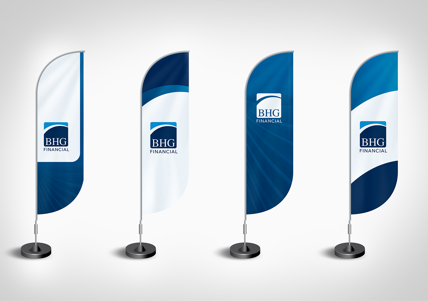
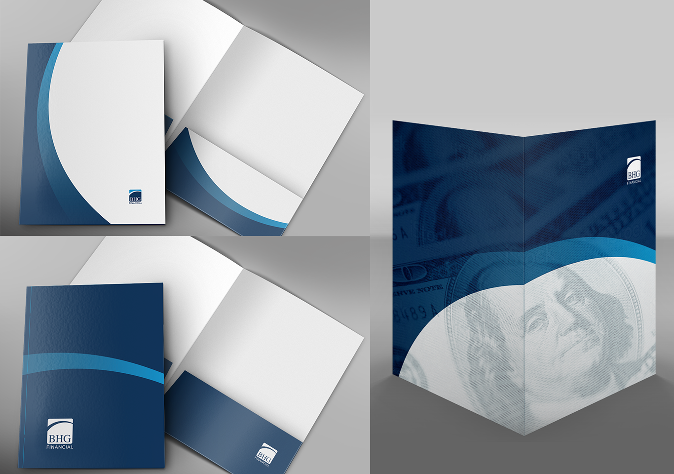
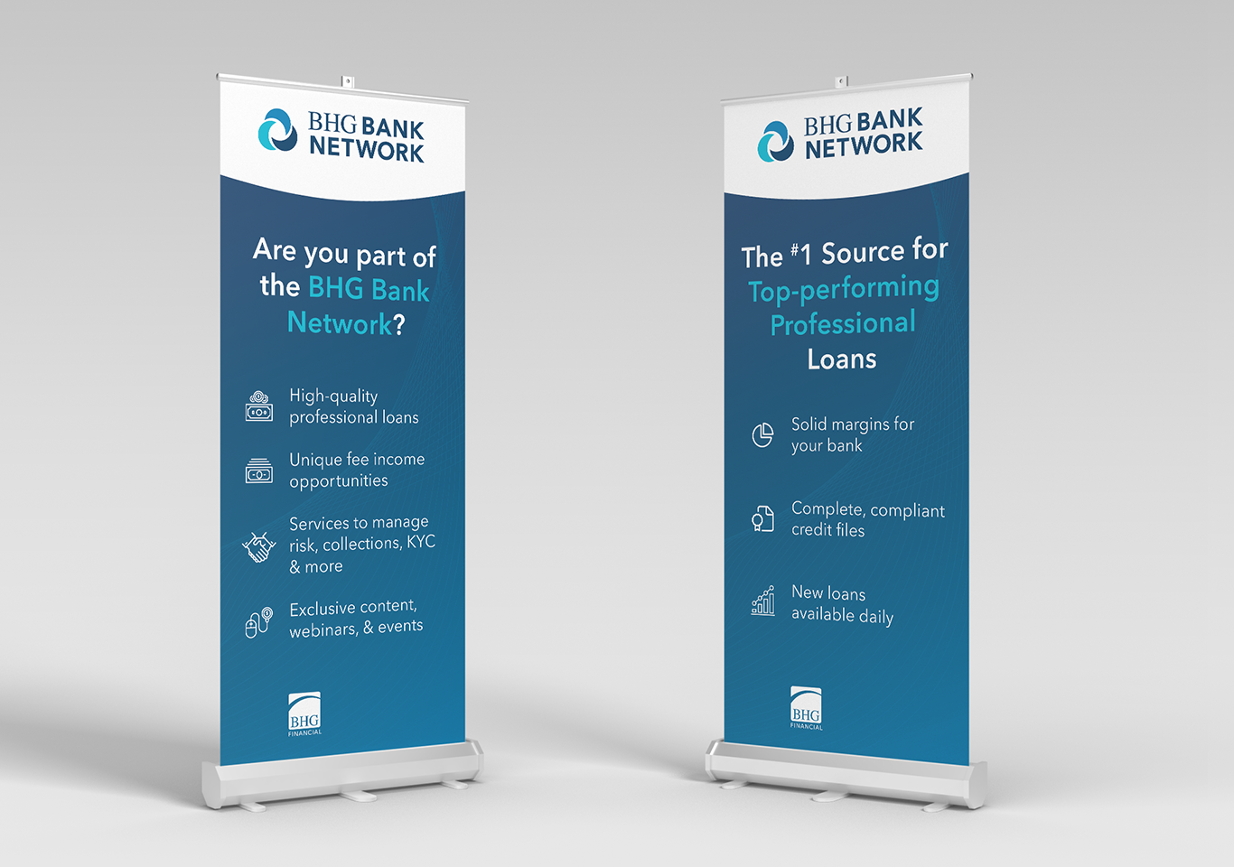
I didn’t create the logo or core identity, but I owned everything around it. I refined the system through typography, texture, layout, tone, and design patterns, making it bank-friendly without making it stale. It needed to feel modern, clean, and usable across digital, print, and events while still speaking to a traditional financial audience.
What I Led and Delivered
Brand refinement & rollout
- Expanded on the existing brand direction to build a flexible, usable system
- Created clear rules for typography, texture, layout, and brand hierarchy
Creative execution across channels
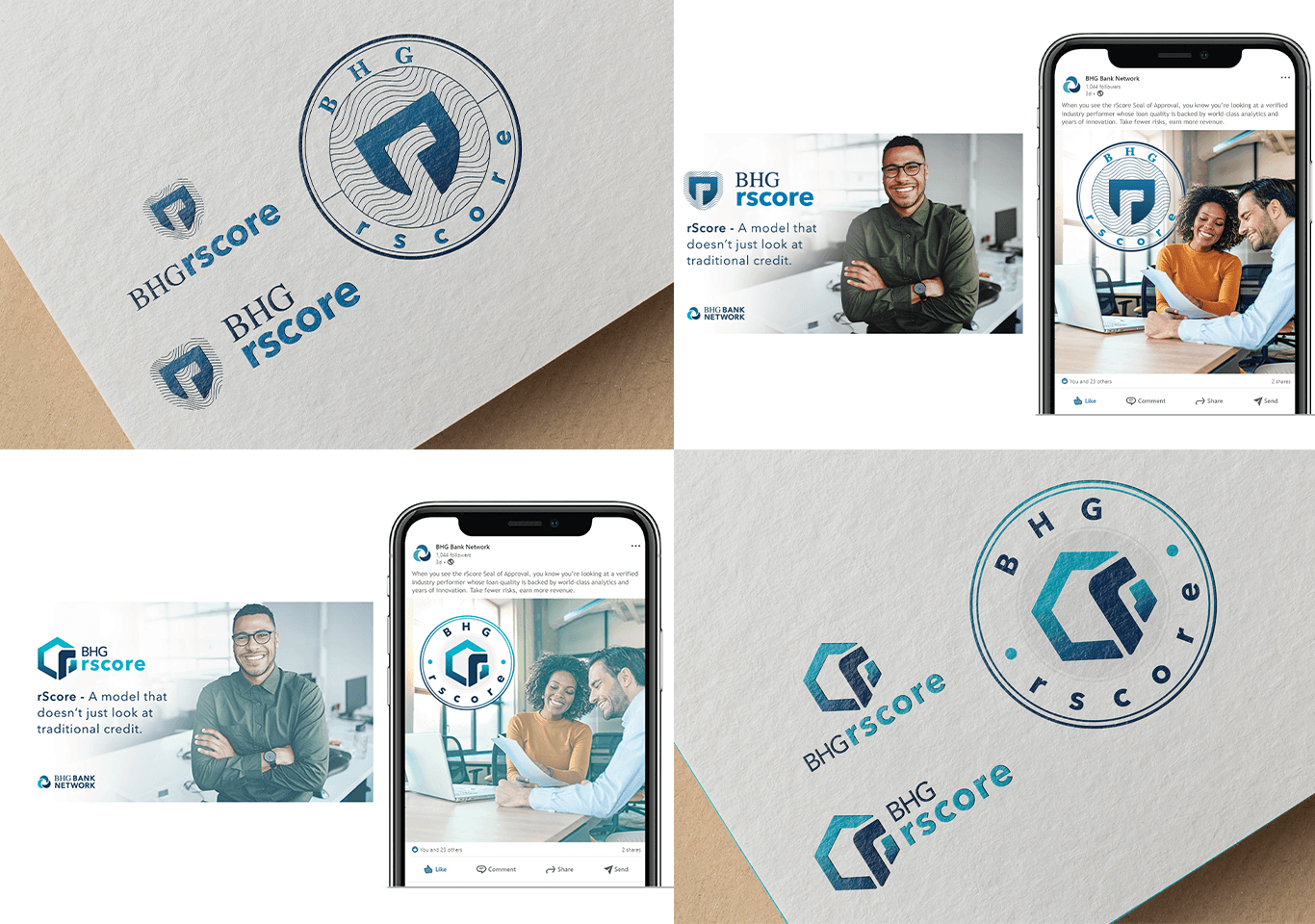
- Led design for web, email, print, events, and internal communications
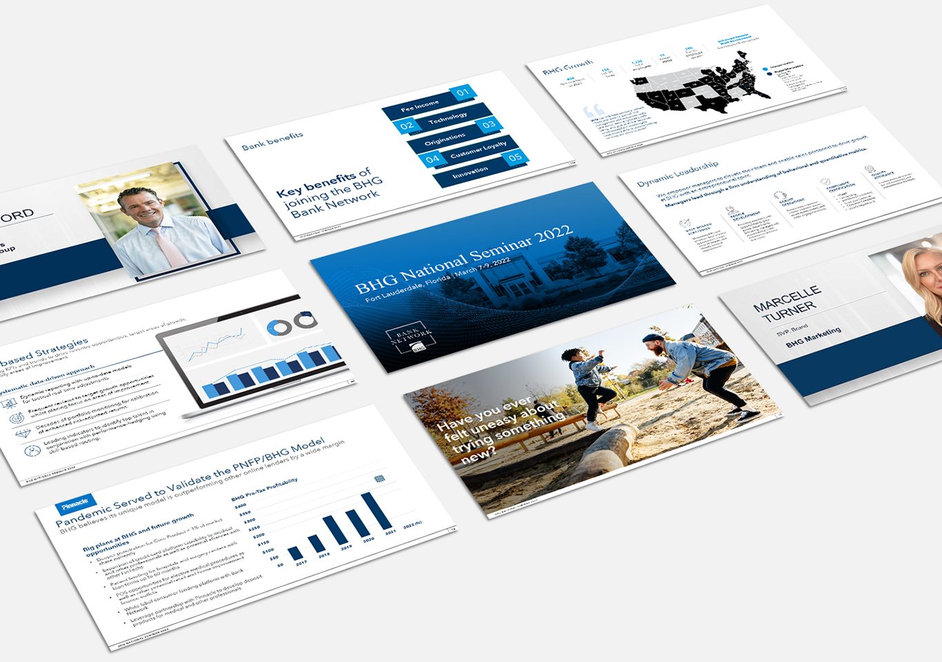
- Developed presentation systems, templates, and marketing materials used across departments
Cross-functional alignment
- Worked closely with marketing, content, and executive teams to roll out consistent creative
- Replaced years of ad hoc materials with cohesive, scalable assets
The Result
What had been a loosely defined visual identity became a fully functional brand system. The creative work brought clarity, consistency, and structure to the Bank Network’s presence across channels, giving internal teams the tools to move faster and present with confidence.
Client
BHG Financial
Designer
Angela Rogers