ETV Software
Redesigning Without Letting Go
Refreshing a legacy logo while keeping its roots intact
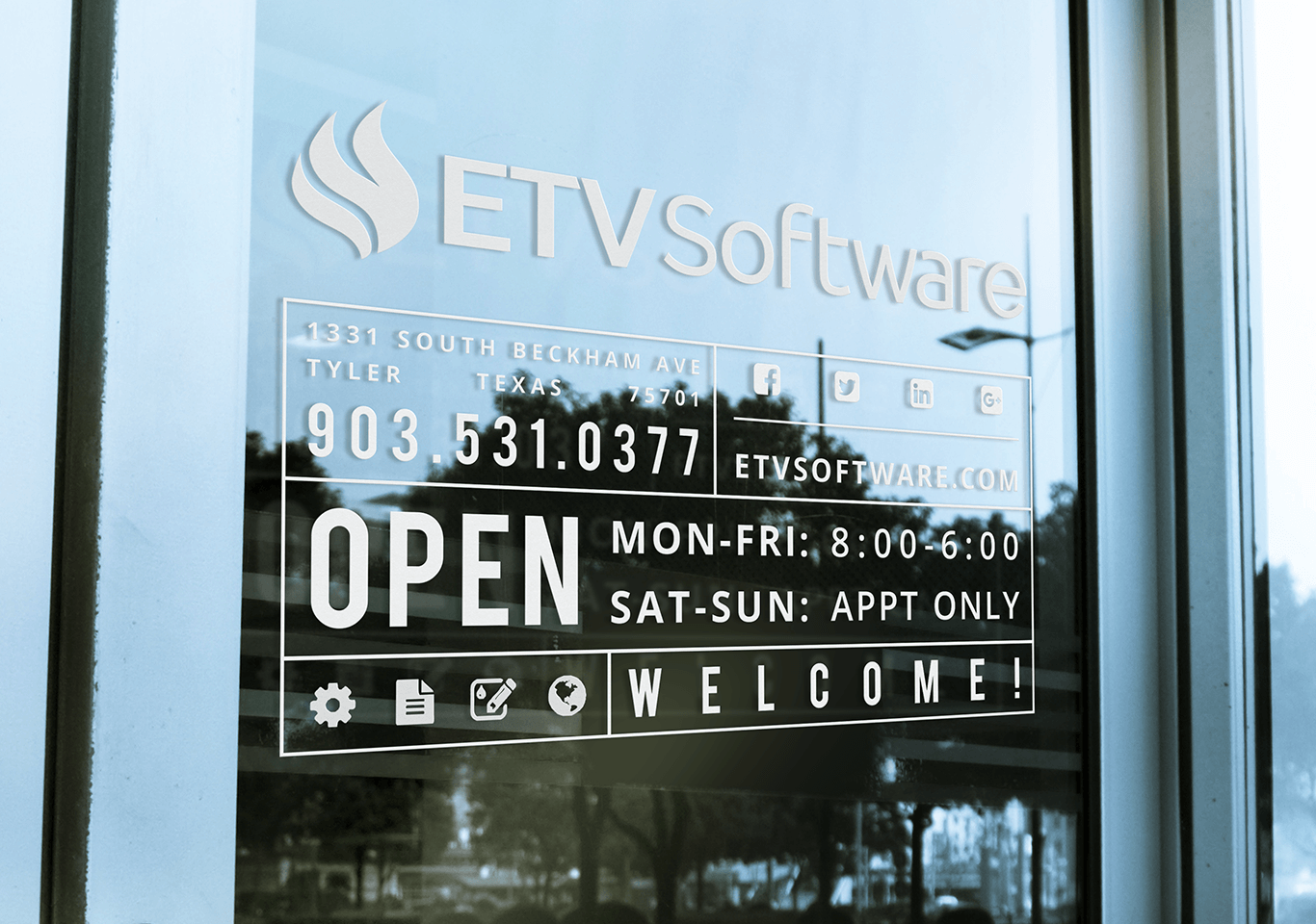
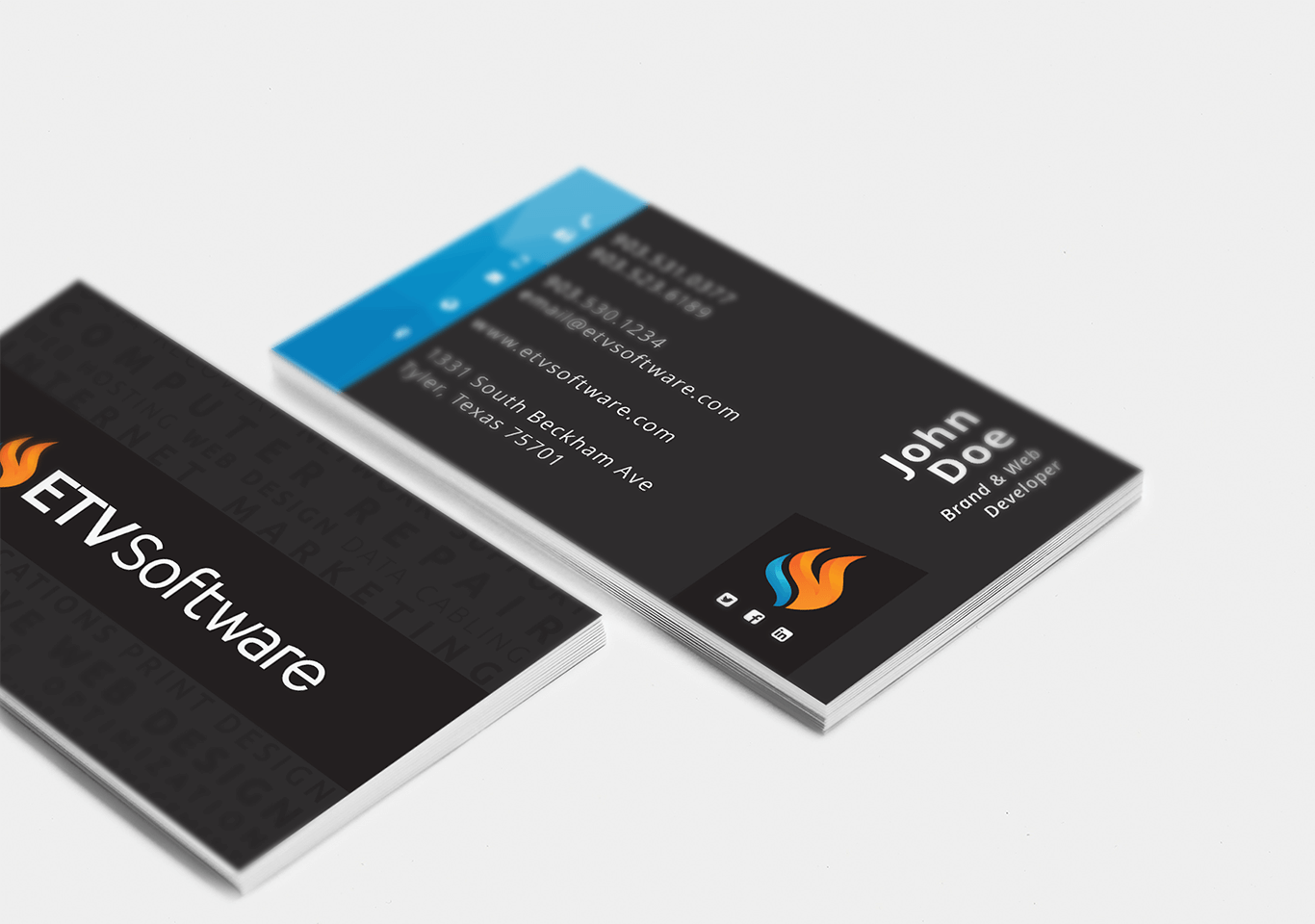
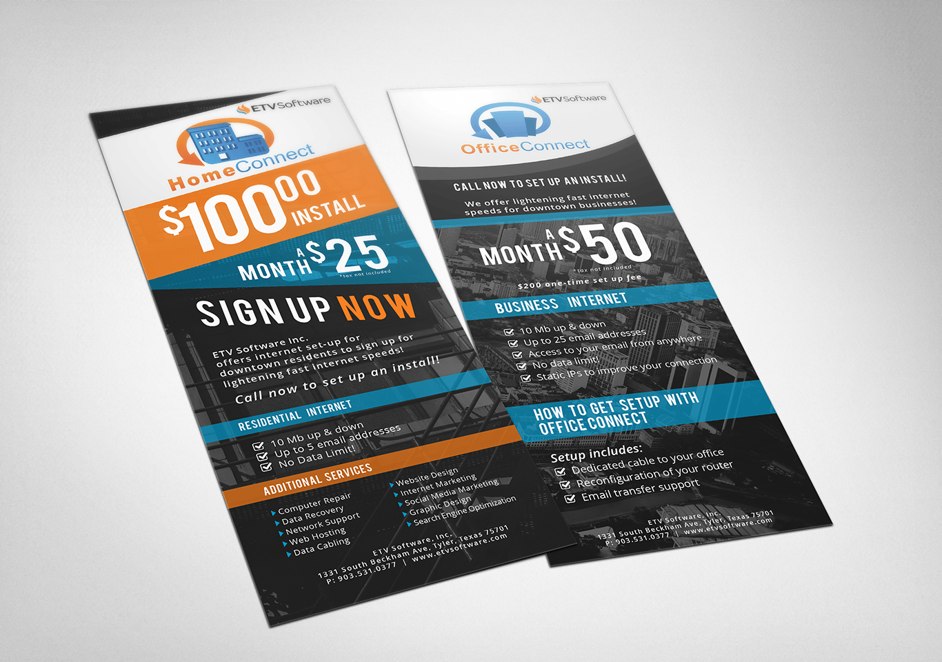
ETV Software’s original logo had sentimental value. The owner built his business in the oil and gas industry and was deeply connected to the flame symbol it featured. But the mark hadn’t aged well, it was visually dated, uneven in composition, and unusable at small sizes. The goal was to modernize the brand without breaking its emotional connection. I kept the flame icon but simplified it for balance and clarity. I also created a custom type and refined the orange and blue color palette to work seamlessly across digital and print.
To help make the case, I walked the owner through how updated branding builds trust and credibility, especially when selling to more refined, business-facing clients. Once aligned, I extended the new identity across business cards, print materials, and digital channels.
What I Led and Delivered
Logo & Visual Refresh
- Redesigned a legacy mark while preserving its core symbolism
- Simplified the flame, balanced spacing, and built custom type for a clean, modern lockup
Brand Modernization
- Refined the original palette to work across print and digital
- Aligned the overall look with industry expectations and competitor landscape
Full Brand Rollout
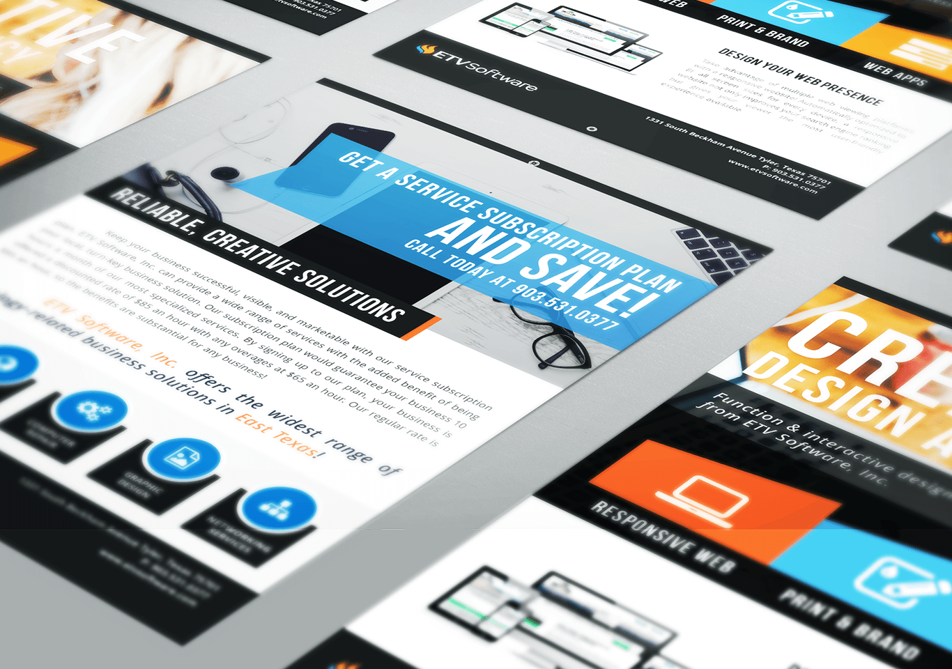
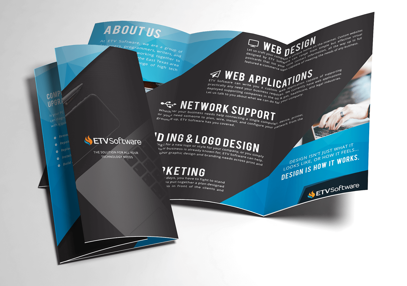
- Applied the new identity across print materials and digital assets
- Delivered a unified, usable system still in use today
The Result
The new logo retained what mattered and fixed what didn’t. It’s still in use, still recognizable, and finally built to scale.
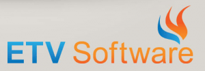
The original logo was meaningful to the founder, but struggled in modern use; dated colors, uneven spacing, and no scalability.
Client
Designer
Angela Rogers