
Rangel Construction Company, LLC.
Built to Reflect the Work
Visual identity and website design for a family-run pool and concrete business
Rangel Construction Company came to me with nothing but a name and a basic business card. I created a complete visual identity from scratch, including logo, business cards, brochure, reflective truck magnets, and a responsive WordPress site. The brand needed to appeal to both residential and commercial clients, with a stronger focus on commercial pools. To balance trust and professionalism, I kept the visuals clean, modern, and minimal.
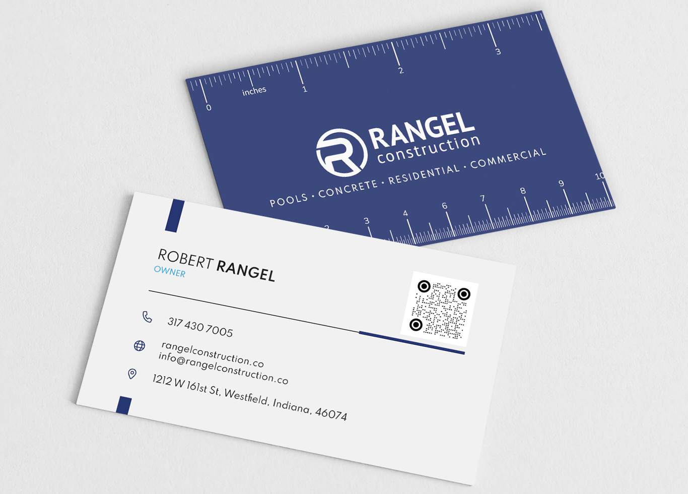
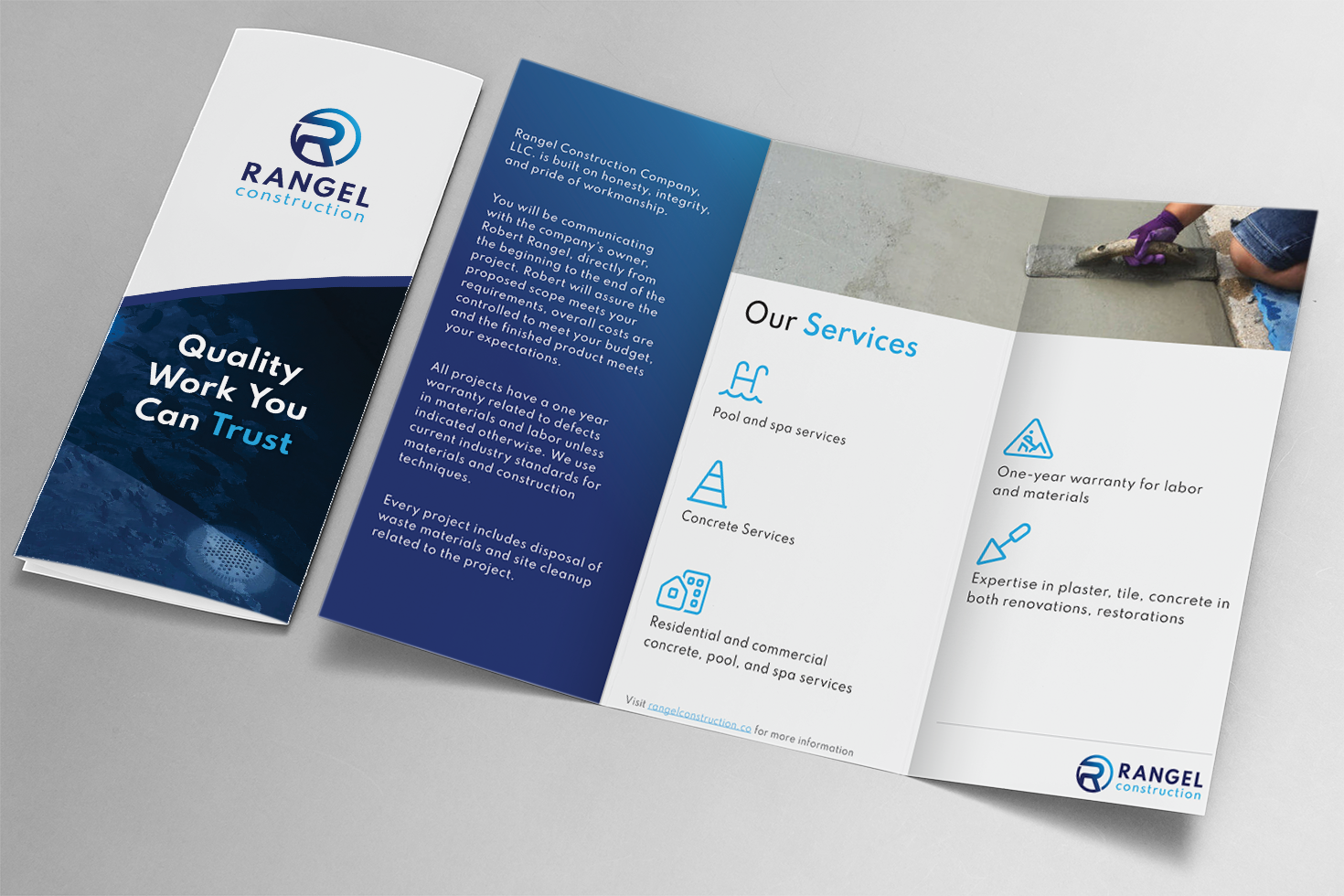
The logo is a stylized R encircled by a stamp-like shape. The blues represent water and clarity, while the circle reflects the company’s full-service approach, concrete, spa, and pool work delivered start to finish.
What I Led and Delivered
Branding & Identity
- Designed a clean, modern logo system centered on simplicity and versatility
- Developed a flexible look that could scale across print, signage, and digital use
Web & Digital
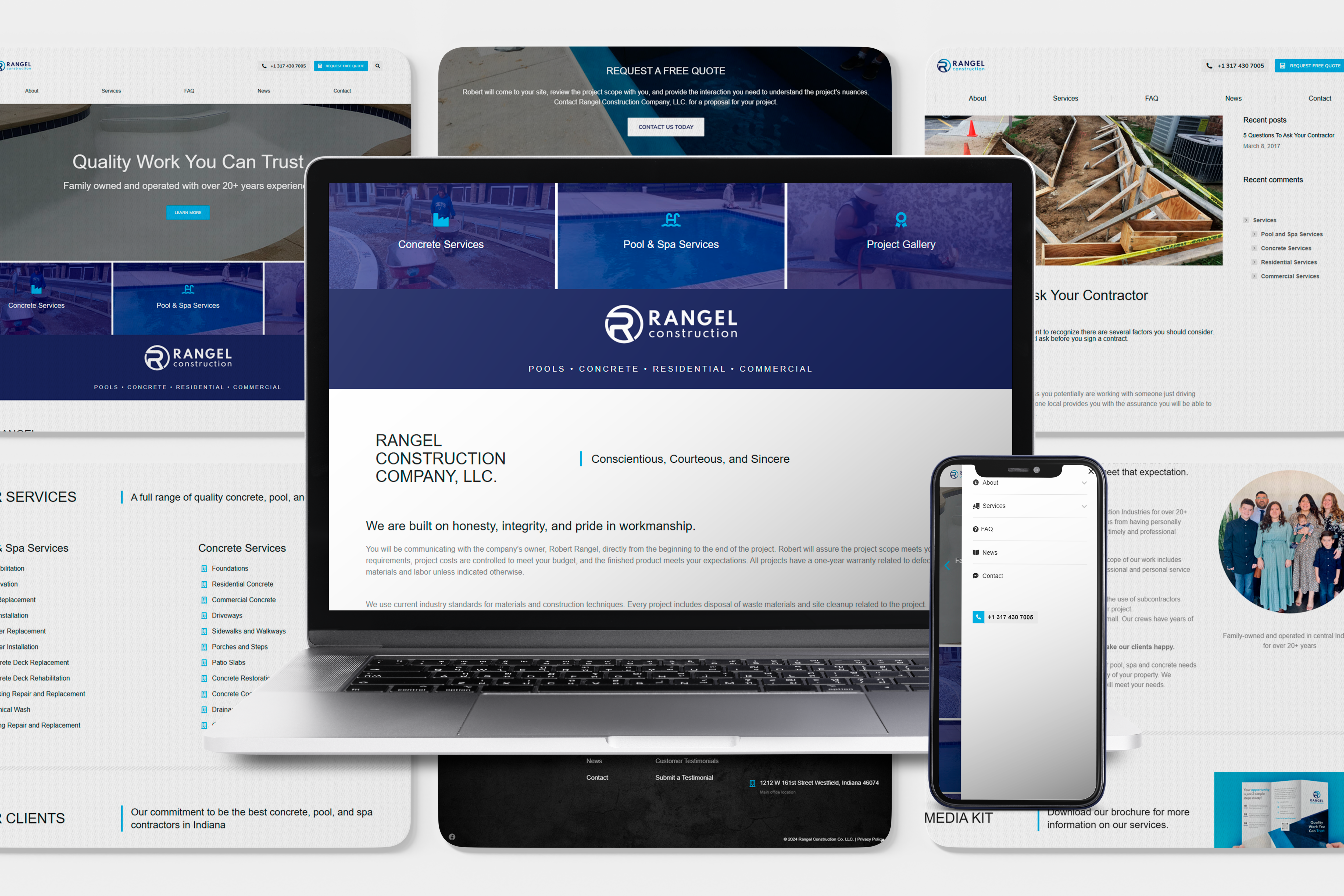
- Designed and built a responsive WordPress site to showcase services and completed projects
- Handled all design and development work for a fully functional launch
Print & Field Assets
- Designed brochures, business cards, and reflective vehicle magnets for visibility and consistency in the field
The Result
Rangel Construction now has a complete brand presence, from trucks to brochures to a functional, mobile-ready website. It’s simple, polished, and reflects the quality of their work.