Treatment & Learning Center

Designing with Heart
Creating a brand and website for a clinic focused on children with autism
The Treatment & Learning Center wanted to establish its own identity, separate from its parent organization, to better represent its ABA therapy services for children with autism. I created a full brand package including logo design, marketing materials, and a custom responsive website.
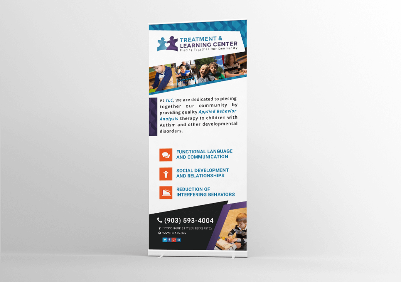
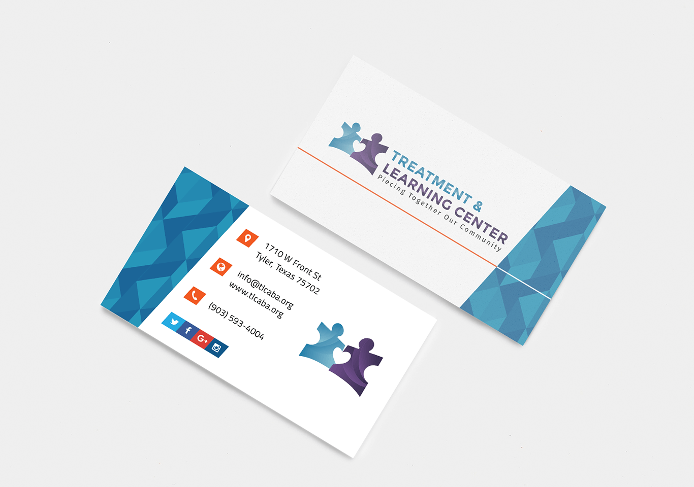
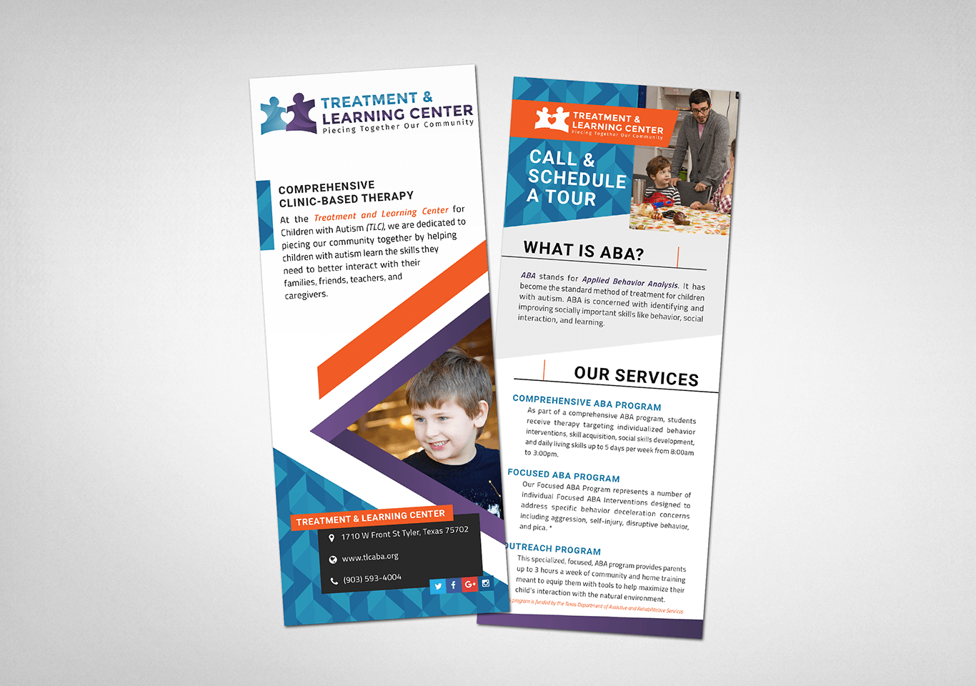
The logo uses interlocking puzzle pieces (a widely recognized symbol for autism) and incorporates a heart in the negative space to reflect the care and connection at the core of their work. The color palette is bright, bold, and high-contrast, chosen to feel energetic and engaging for both kids and caregivers, while also being accessible and clear.
The website was designed to be functional and approachable, with features like an events calendar, staff directory, integrated social feeds, and a CMS for easy updates.
What I Led and Delivered
Brand Identity
- Designed a logo rooted in autism symbolism with a heart-shaped negative space
- Developed a vibrant, high-contrast color system to reflect energy, learning, and inclusivity
Website Design & Build
- Built a responsive site focused on clarity, accessibility, and day-to-day usability
- Included CMS, staff directory, event calendar, and social integration
Supporting Materials
- Delivered branded collateral to support outreach and visibility in the community
The Result
A playful, kid-focused brand that still felt professional and approachable, giving the clinic a clear, confident identity of its own.
Client
Designer and Developer
Angela Rogers